Carrier Dashboard
Where Control Tower opens by default, and the screen to bring to a carrier review: who is delivering on time, who is carrying the volume, and what each one is costing you.
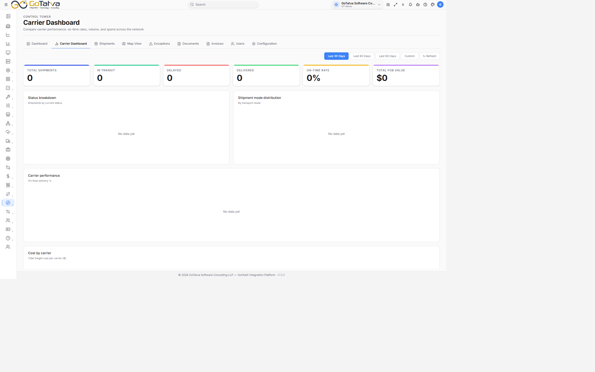
Carrier performance and spend over the last 30 days.
Choosing the period
Last 30 Days, Last 60 Days, Last 90 Days, or Custom with two date pickers. ↻ Refresh re-reads without changing the period.
The numbers
| Card | What it counts |
|---|---|
| Total Shipments | Shipments in the period |
| In Transit | Currently moving |
| Delayed | Currently late |
| Delivered | Completed in the period |
| On-Time Rate | Share delivered on time, as a percentage |
| Total FOB Value | Total declared value |
The charts
- Status breakdown - shipments by current status.
- Shipment mode distribution - by transport mode.
- Carrier performance - on-time delivery %, carrier by carrier.
- Cost by carrier - total freight cost per carrier.
Any chart with nothing to plot reads No data yet.
Carrier summary
One row per carrier:
| Column | Notes |
|---|---|
| Carrier | |
| Shipments | Volume in the period |
| On-time % | With a bar - green at 90% and above, amber from 75%, red below |
| SLA | Met at 90% and above, Risk below it |
| Cost | Total freight cost; a dash where there is none |
What "Risk" means
Risk is a threshold, not a judgement - it marks any carrier under 90% on-time so it stands out in a review. Read it alongside the volume column: 80% across 200 shipments is a different conversation from 80% across five.